Despite its title, and despite the news this week, this post has nothing to do with David Bowie.
It’s to do with another legend: a consistent creative performer over several decades.
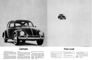
I’m talking, of course, about the wonderful, creative, simple, visual adverts (particularly press and posters) for VW, created by their agency since time immemorial – DDB.
They were used as examples of simple, lateral thinking – while still being effective and getting the key message across – when I was an ‘ad student’… and I think they still are.
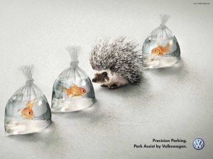
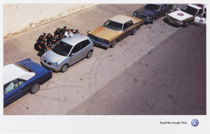
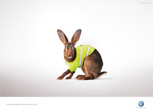
From the classic 1960s VW press ads, right up to modern day (quick posters, TV ads, digital campaigns), the ads highlight one consumer benefit and show it in a quick, ‘clever’, visual way (or play on it in the body copy):
For anyone working on the VW account, this heritage of strong, visual ads means there’s a lot to live up to in creating any new ones.
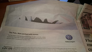
Sadly, this doesn’t quite make the grade:
I saw it yesterday. I looked at the visual, was a little confused, then looked at the line underneath it; ‘The Polo. Now packed with extras’.
This then made me think, is the visual supposed to be a ripped page? Or… looking at the black bits, is it a craggy mountain range? That wouldn’t make sense though.
My girlfriend was sitting next to me, on the tube, so I asked her: ‘Can you work this ad out? What’s the image showing?’
She said she thought it was ‘rips’, but wasn’t sure why (I’d had an inkling that the idea was ‘the car is full of extras, so it’s heavy).
The point is, neither of us ‘got it’ instantly, and most people wouldn’t spend anywhere near the same amount of time trying to work it out – they’d just turn the page.
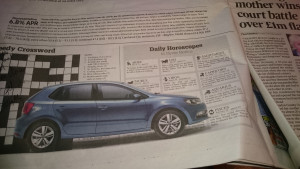
It was only later that evening, when I was flicking back through the newspaper, that I spotted the second part of the ad… at the bottom of the page:
Now I ‘got it’… just: the Polo is so heavy (so ‘full of extras’) that it’s fallen through the ad.
This VW ad, Vs the VW ads of the past, doesn’t quite work because it’s just trying to be that little bit too clever.
The VW ads of the past could be understood instantly: ‘aaah, I get it – that’s smart’.
They weren’t trying too hard, they were just simple, lateral thoughts. This ad, above, is just a tad too contrived: it’s the kid showing off his/her vocabulary, rather than simply coming across as naturally articulate.
It’s a good effort, but it’s not quite ‘there’.
It’s tough following in the footsteps of legends.
